Resolving complex data mismatches to reduce users' frustration

End-to-end design process emphasizing UX Research to identify pain points and shape evidence-based solutions that enhance user experience and align with business objectives at Blackbird.ai (Constellation).
This case study aims to illustrate my end-to-end design process, emphasizing the importance and value of UX Research in risk reduction. This approach allows for identifying pain points and shaping solutions based on evidence that enhances the user experience and aligns with business objectives.
Challenge
I was the Product Designer responsible for this project, partnering with a PM and a Tech Lead to work in a platform called Constellation, which for this particular project the focus were on two pages: Analyze and Network Graph.
Users struggled to understand why the Network Graph didn't display the same Twitter metrics as the Analyze page, which caused confusion and frustration.
Goal
The goal was to reduce user confusion and frustration related to the data mismatch between the Analyze and Network pages and reduce the number of customer support tickets created within this topic.
Research
Translating data structure in Constellation
My first step was understanding how the data is structured in Constellation as a whole and the differences between these two pages.
I discovered that:
- Users specify Data Collection rules when adding data to a project in Constellation.
- At the Data Processing phase, this data added is considered 'Local Data'
- The Analyze page, displays booth Local and Global data. However, the Network Graph uses Local Data exclusively to create the visualization, formed by Nodes and Edges.
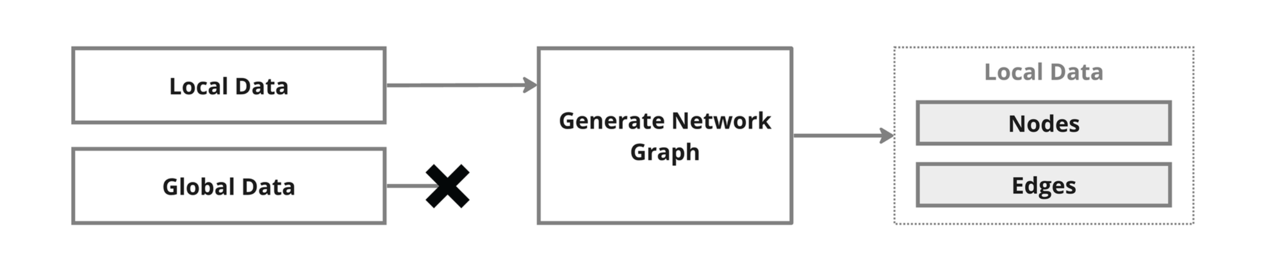
- Users expect to see the same data between booth pages, but this does not happen, leading to unmet expectations and user frustration.
- Also, the Network page doesn't provide detailed information about the data selected, making it harder for users to understand what will be rendered in the graph visualization.
Key Findings from internal user interviews
Interviews were conducted with the Intelligence Team to understand their needs and pain points related to the Local and Global data scenario.
From these interviews, we found that:
- Even experienced Intel Analysts found the distinction between Local and Global data confusing.
- Intel Analysts indicated that they explained the differences between Local and Global Data during training but felt the explanation could be improved.
- Intel Analysts found 'Extended Data' valuable for providing context to a story.
- Analyze and Network graph pages were being used in different ways by different users.
Problem identified
After the Research, it was possible to understand that the issue is not solely due to the data mismatch between the Analyze and Network Graph pages, but also because of the complexity of data presentation and organization in Constellation.
Notably, the differentiation between local and global data could be clearer, even for internal users. This confusion is likely to be amplified for external users.
Design
To address the problem identified, it was important to tackle booth Analyze and Network pages, with the intent of making them more connected, reducing the data mismatch and complexity between them. The first step was to improve the Analyze page, adding ****new data counts, renaming, and regrouping all the data.
Analyze page
We introduced new data counts to the Analyze page, ensuring it has the same data as the Network graph page.
The data were renamed as logically as possible, matching well-known Twitter terms like "Repost" and "Replies."
Also, the data were regrouped into three main categories: Posts, Engagements, and Signals to reduce the complexity and cognitive load on the users.
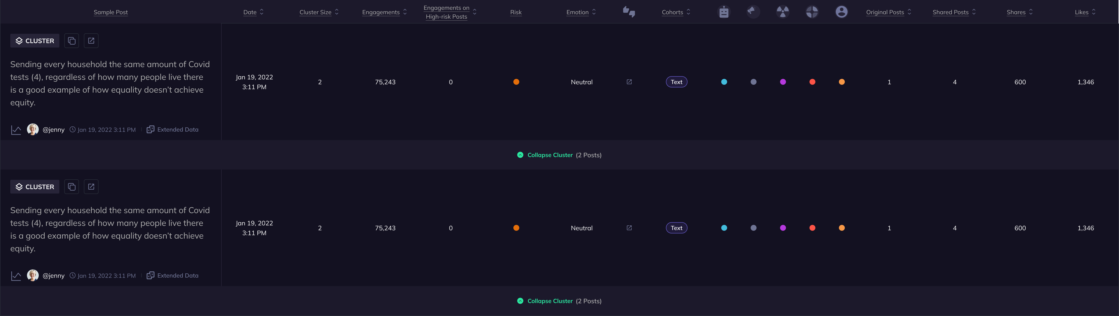
The data organization changed from this:
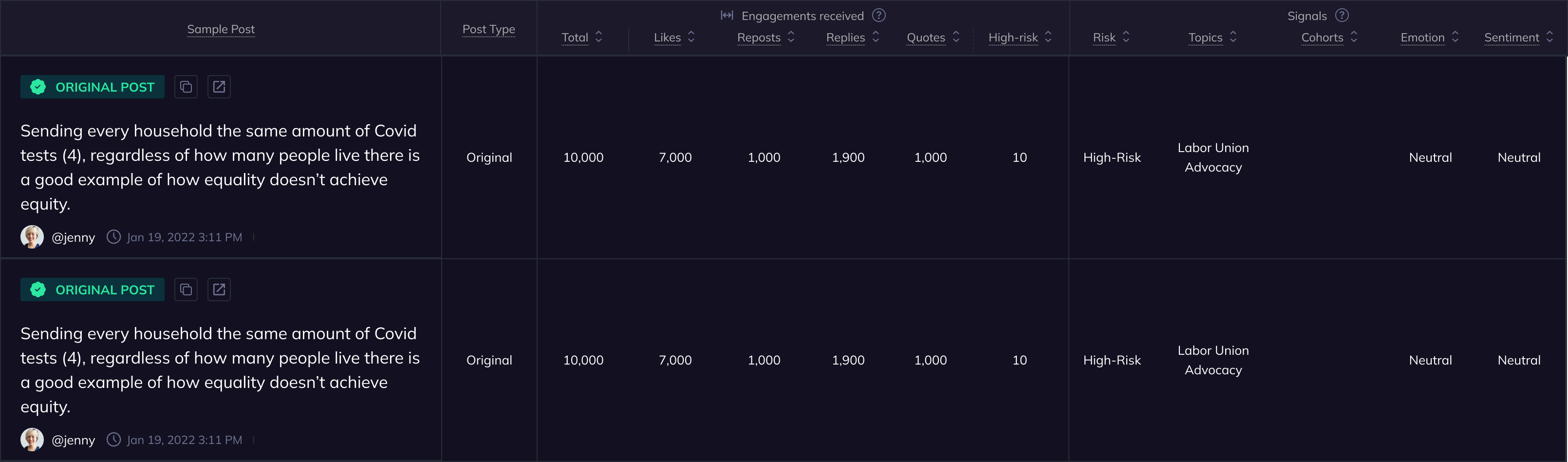
To this:
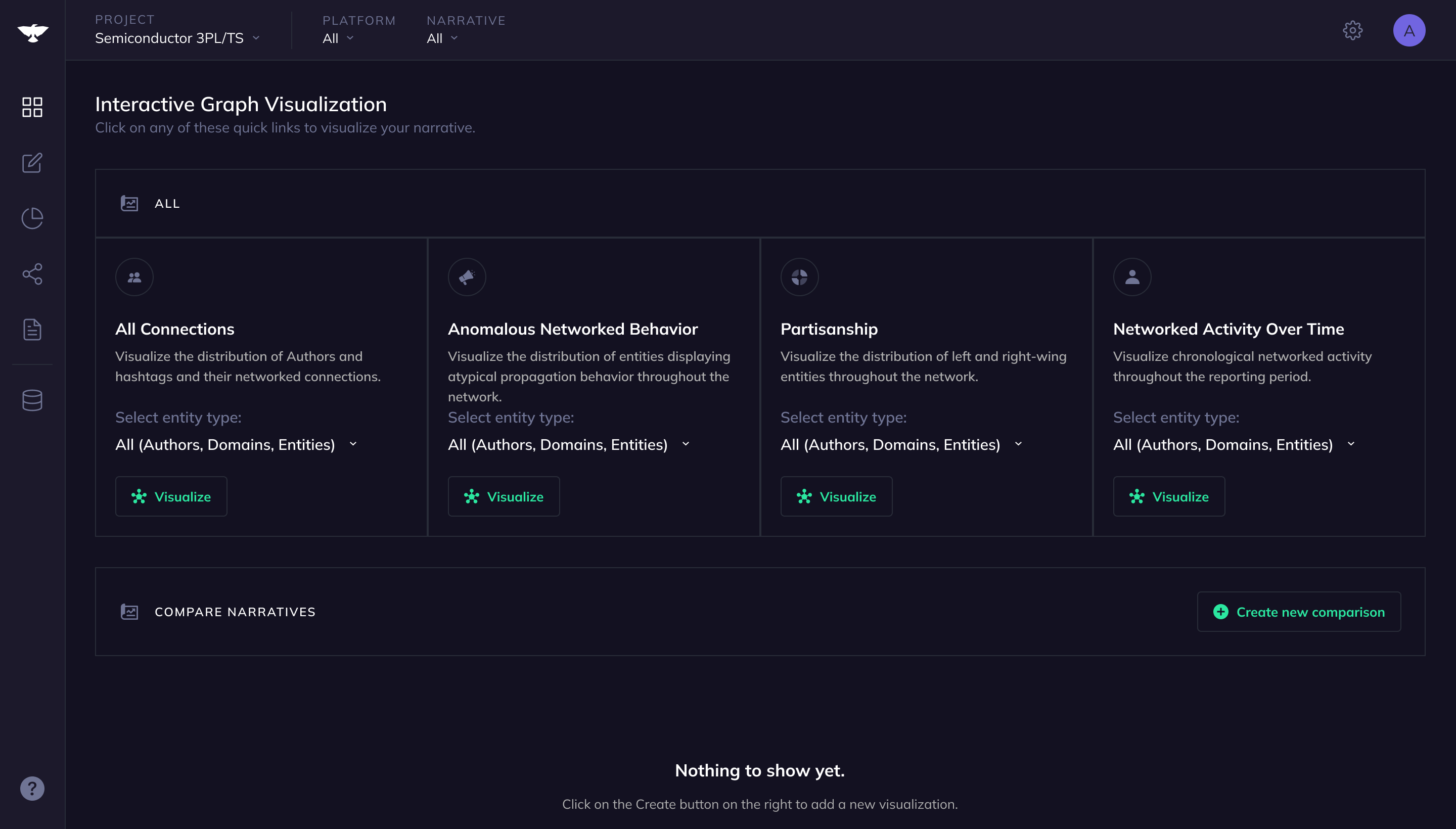
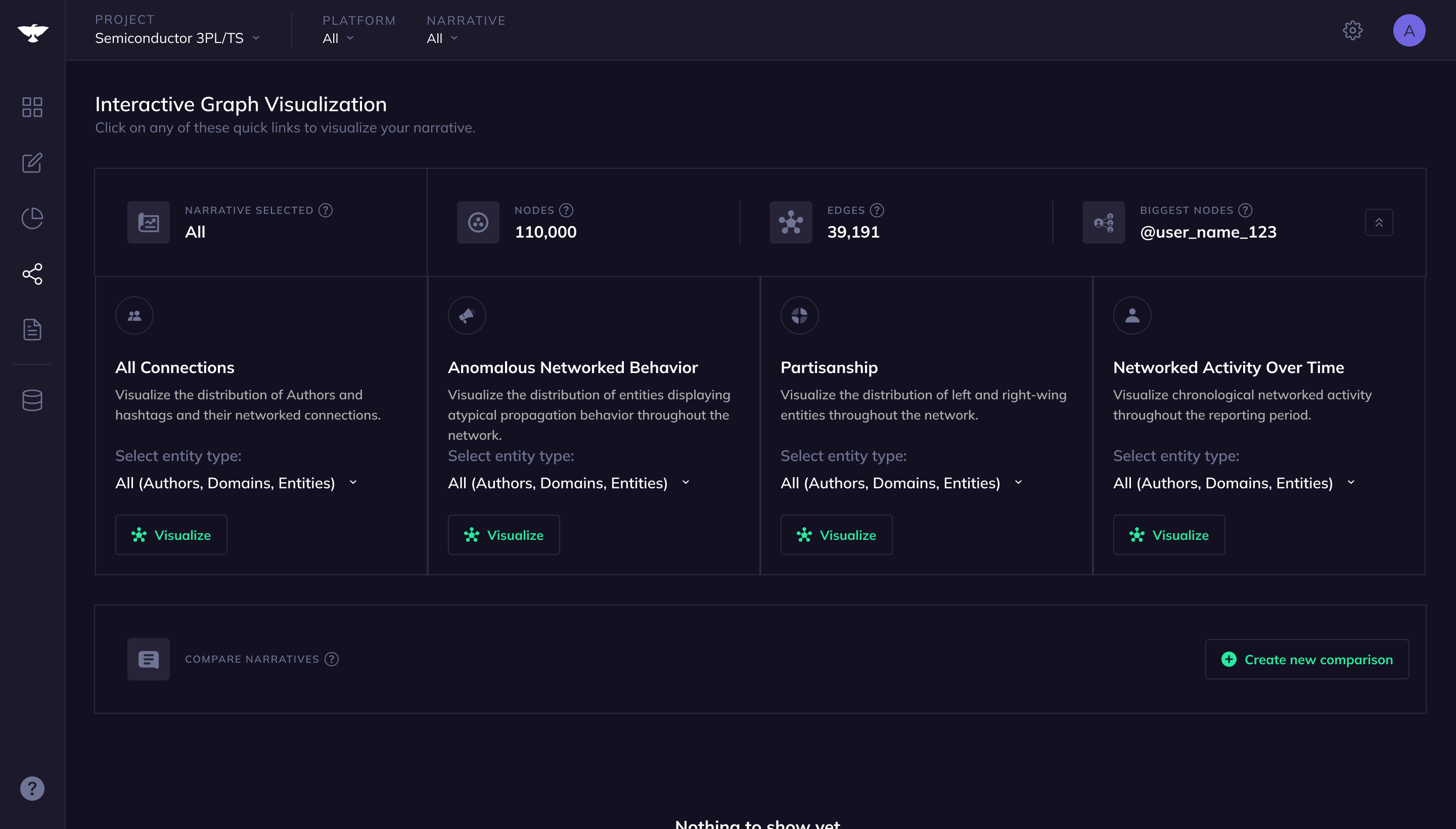
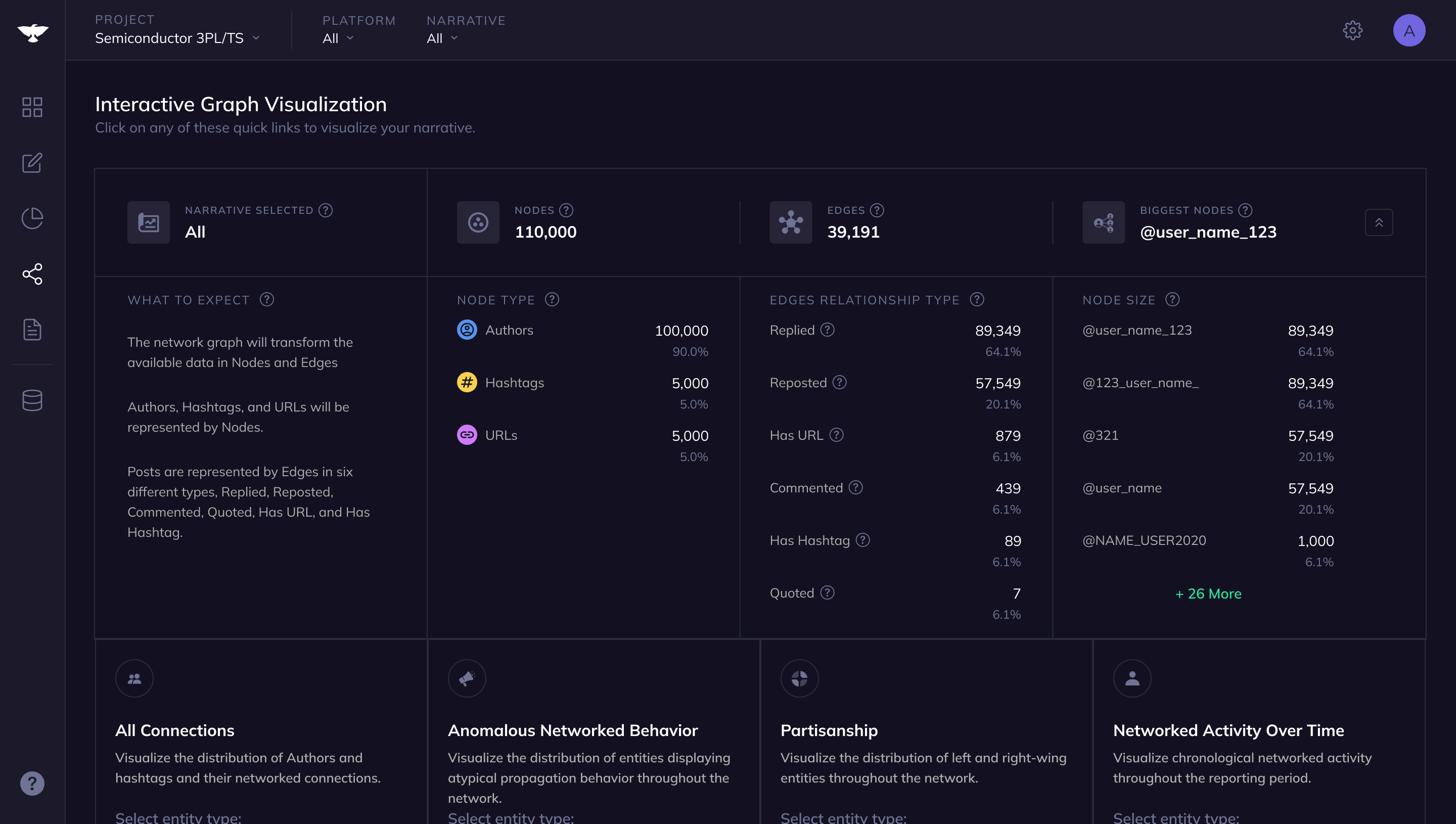
Network graph page
Data selected preview
On the Network page, we introduced an expandable element to preview data. This new feature not only displays Network data statistics before users generate the visualization but also serves as an educational space.
It clearly shows the translation of data from the Analyze page to the Network page while respecting the constraints of the visualization tool. This enhancement was intended to provide users with a better sense of what they would see in the graph visualization, thereby reducing unnecessary navigation between pages and alleviating user frustration.
The Network graph page changed from this:
To this:
Video showing the data preview expanding
Video showing the data preview expanding
Business Impact
After one month of the release of these features, it was possible to see a 14% reduction in customer support tickets generated because of this issue. In the second month, the number increased to 39%.